Global USC Branding
In my position at the University of South Carolina Study Abroad Office, I get to work on a surprising variety of projects. While all of my projects are related to the office and to study abroad, some are revamps of previous campaigns, some are for audiences different than our usual target and some are brand new programs.
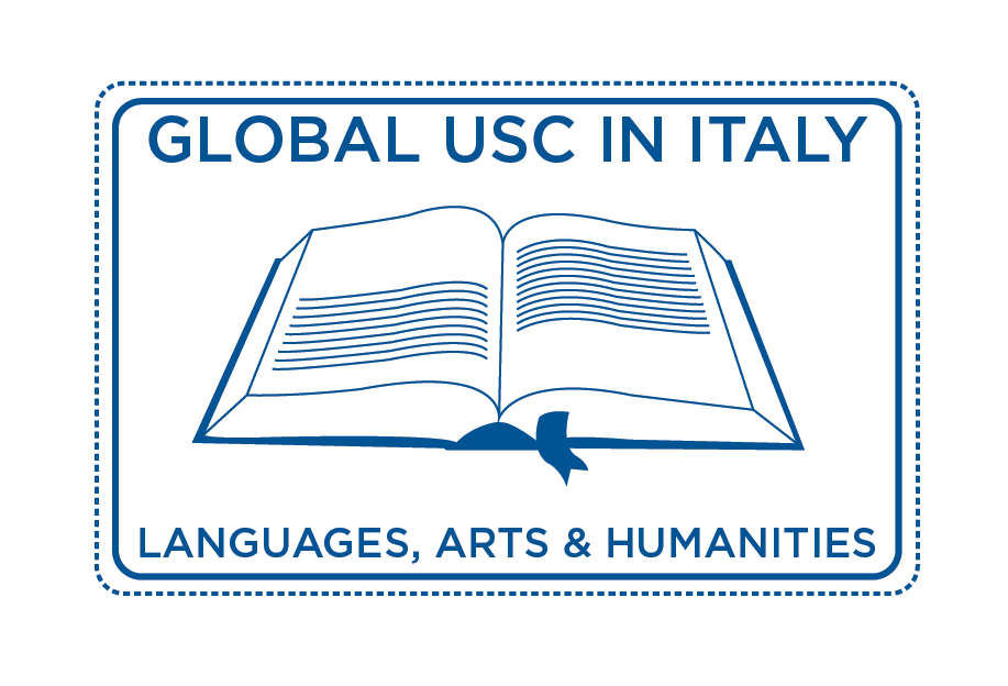
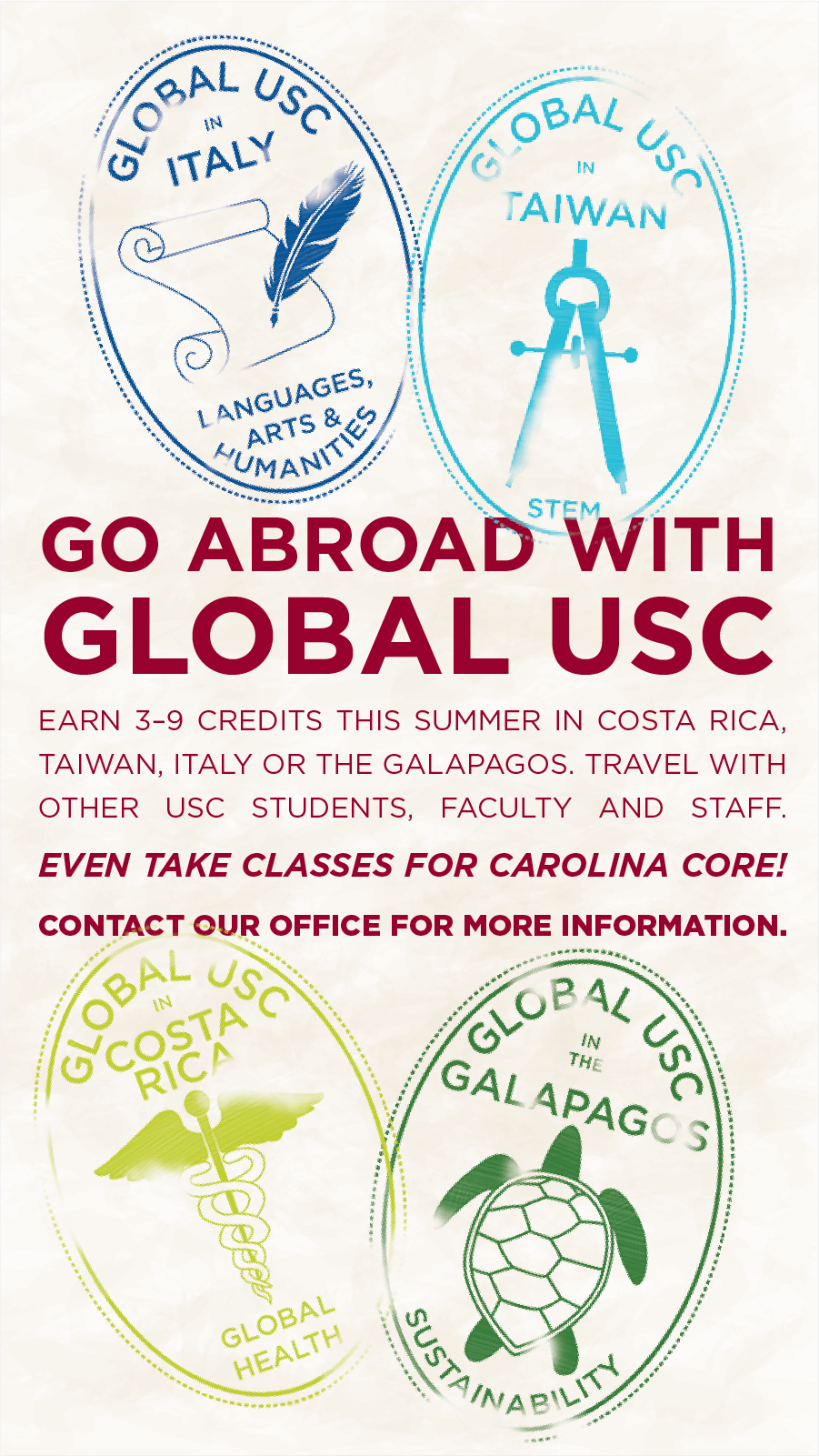
In 2015, the SAO created USC in Italy, a summer program in which students travel with a cohort of other USC students and USC faculty to earn credit in Italy. The program had a theme of "Languages, Arts & Humanities," and in 2016, we added on USC in Costa Rica: Global Health. Sick of the awkward ellipse in the portfolio name "USC in..." we rebranded to Global USC for summer 2017. With the new name and the addition of programs in the Galapagos and Taiwan (and a graphic designer--me--on staff), came a total rebranding. Gone would be the old logos, below.
So along came the brainstorming phase. My director and I separately but simultaneously came up with the idea to have the new logos resemble passport stamps, so I rolled with it. (Consensus sure does help the design process.) My brain was constantly reeling, thinking about how to make this branding successful. It was on my mind so much, I ended up sketching at home, despite multiple reminders that I don't have to do work at home. But I needed these ideas to get out of my brain!!!
The most difficult part was deciding how to symbolize each program. I couldn't really focus on a landmark, as the city could change from year to year. (It had already happened with Italy.) So it seemed that best option would be to focus on the subject focus for each program: languages, arts & humanities for Italy; global health for Costa Rica; sustainability for the Galapagos; and STEM for Taiwan.
But how do you represent STEM when most of the classes will really be related to engineering?
You can't use a paintbrush and palette when painting wasn't, and probably will never be, offered for Italy.
How medical can you get for Costa Rica, when the students won't necessarily be able to perform medicine?
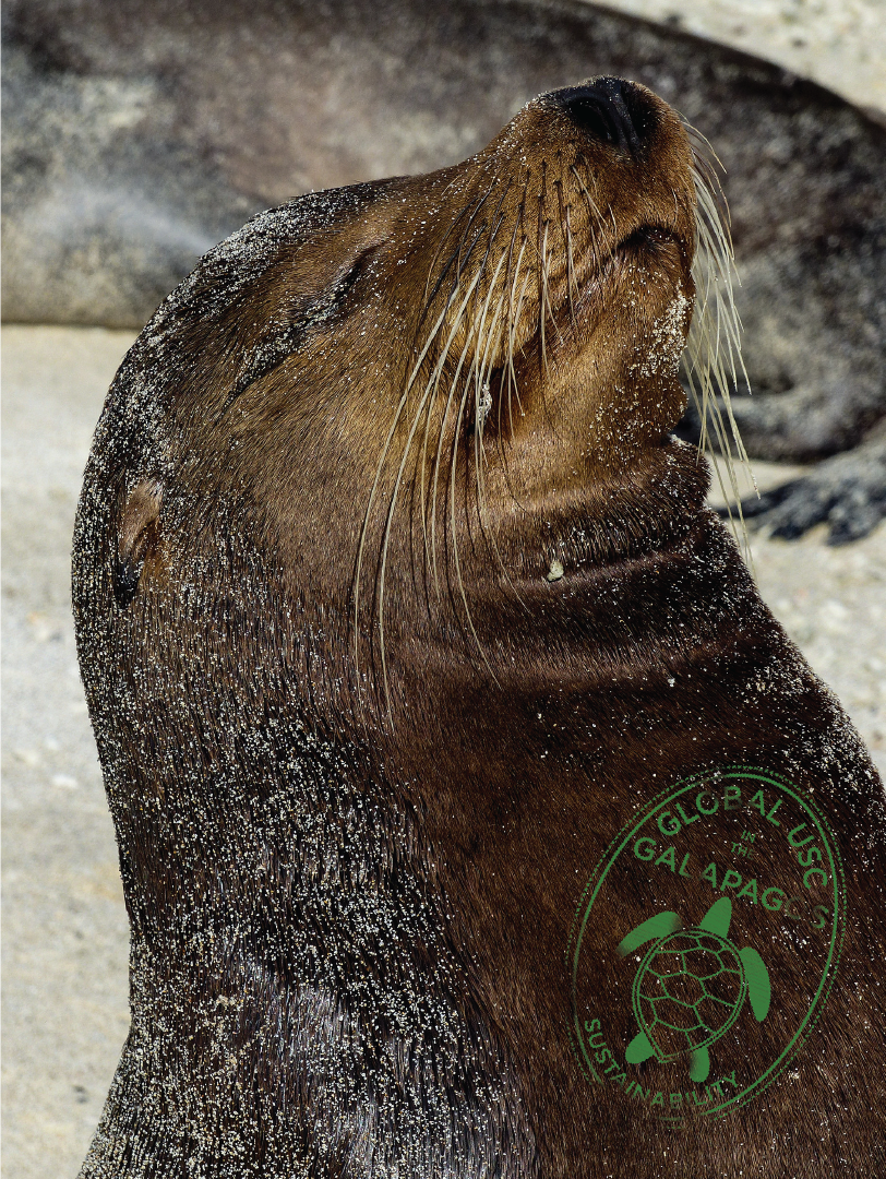
Let's be honest, we're probably going to use a turtle for the Galapagos because turtles.
After some back-and-forth with the staff to come up with the best representations of each program, we had a new set of logos! Next, it was time to get them to use and start marketing.
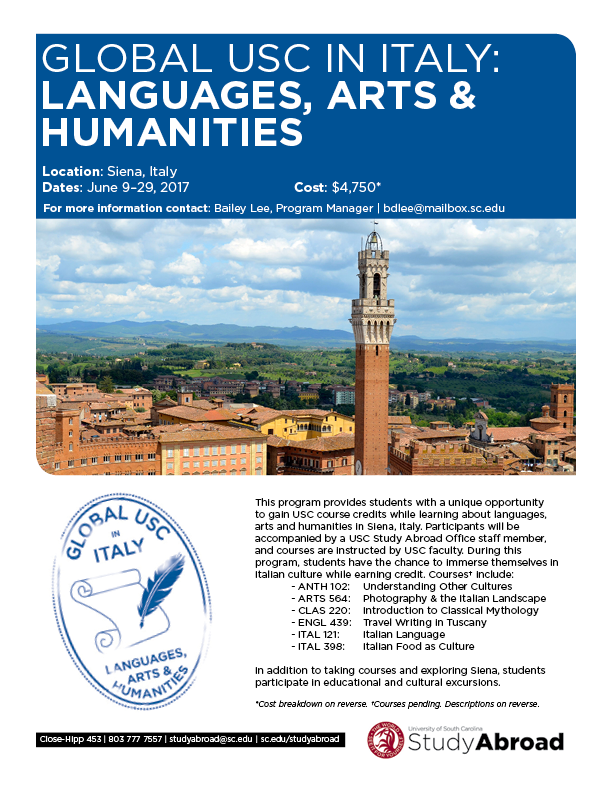
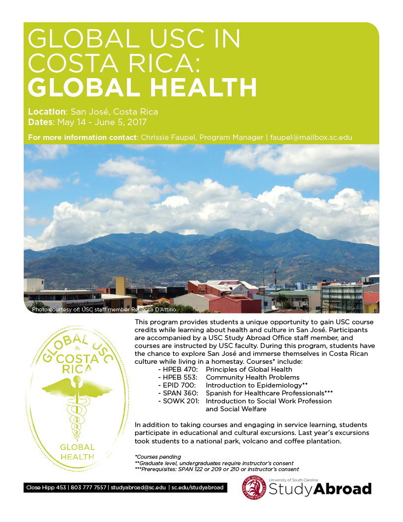
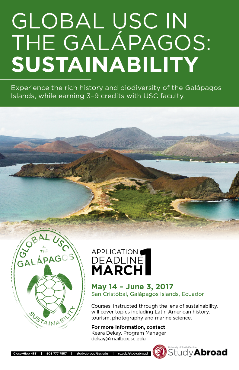
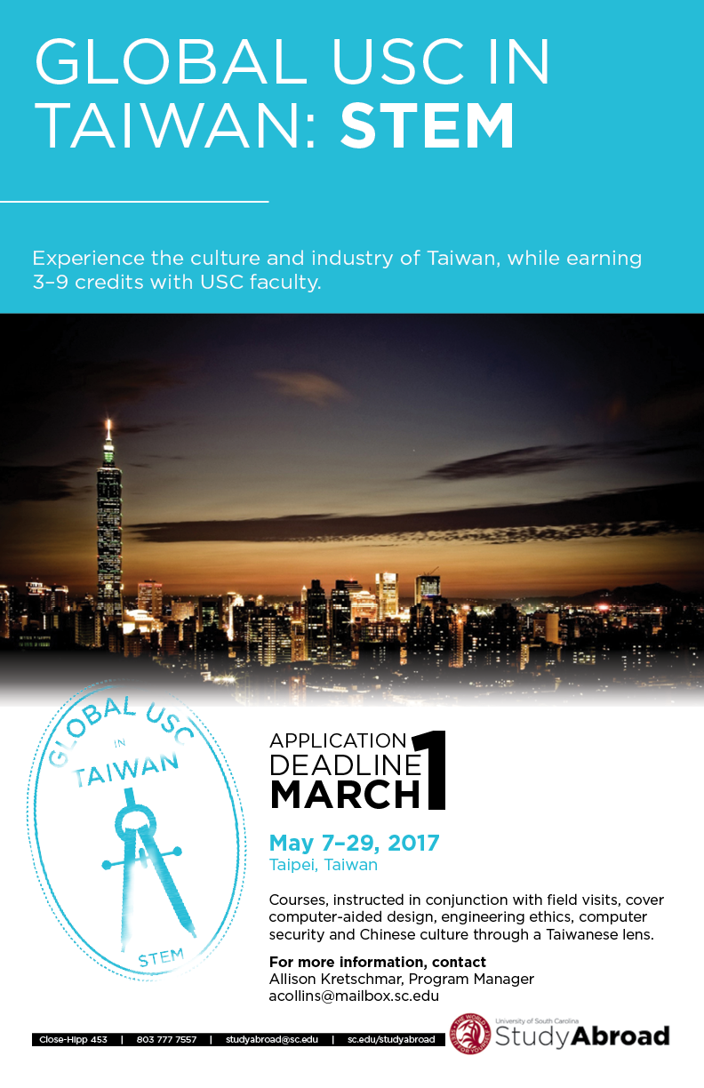
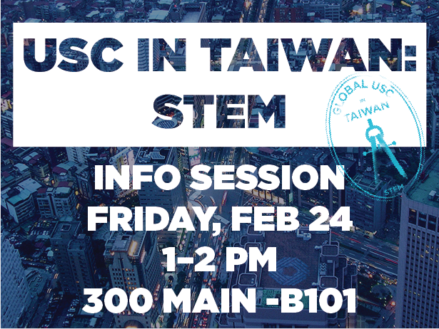
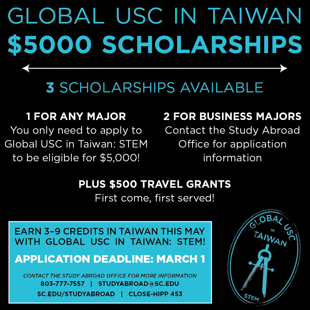
We needed quite a few marketing pieces for the programs, since we had a number of different avenues to explore. I created 11x17 posters, one and two page flyers, social media graphics, digital slides and more. Check out a sampling of the finished pieces below!


